Tag Archives: random

IDW on Google Map

Image

Inspired by bad weather this afternoon, I made this basic Inverse Distance Weighted interpolator, written in JavaScript, displayed by PaperJS objects on top of a Google Map. It makes several randomly placed points with random values, then interpolates the colored surface based on the distance-weighted influence of the points. There are lots of geographic applications that may use this technique (rain, temperature surfaces, etc.), but I’m not feeling too inspired to go further right now. Let me know if you do!

PaperJS-based Minimum Convex Polygon

Image

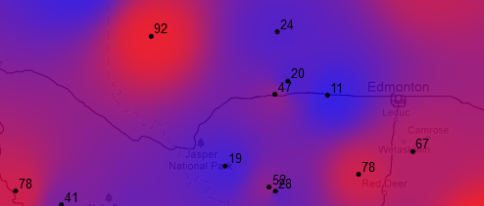
Even though I’m at home sick today (or maybe due to the boredom of it), I’ve been working on improving my PaperJS-based minimum convex polygon (MCP) script (now found here, previously found here). Now, the algorithm is as follows:

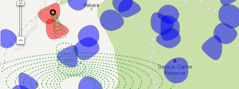
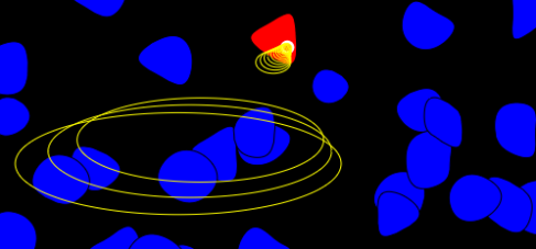
  1. Find the point that is the farthest right
  2. Draw a large circle that encompasses the entire possible field, centred on that point. My circle has a radius of 720px (the field is 500x500px). The circumference of the circle is split every 18px. When those vertices are connected to the centre, there are 252 spokes.
  3. Loop through the spokes, starting with the spoke pointing straight down and moving clockwise. Does the spoke pass through another point (within 5px)? No? Move to next spoke. Yes? Connect the circle centre on that point (a new boundary line of the MCP), move the circle and all spokes to that point. Continue with next spoke to find the next MCP boundary point.

This method isn’t perfect, but it works fairly well. Problems arise when two or more points fall within the tolerance of the spoke hittest (5px). But like I said, I’m sick, so instead of fixing it, I’m going to watch Community.

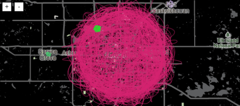
edit: I’m very grateful to SparkGeo’s lab, which finally clued me in to how to interact with a map underneath a canvas element. Hint: canvas CSS = “z-index: 1; pointer-events:none”

Alberta Urban Population Density Map: Gomitoli

Image

OK, this is the last visualization of Albertan Urban Population Density for a while. Again, inpired by this Gomitoli chart designed for Excel, I made this example using Albertan cities. The circle area roughly approximates the true city area, and there is a random point on the circle circumference drawn for every 1000 people in the city’s population. Smoothed PaperJS lines connects the points. Finally jQuery UI sliders and PaperJS buttons enable zoom and pan.

Are you within reach of North Korea?

Image

Want to know if you’ll be safe from North Korea’s 10,000km-range rockets? Here’s a map to figure it out. Interesting fact: the border between Glendale and Phoenix, AZ is 10,000km from Pyongyang.

Note: my web map is a total, shameless, absolute rip-off of the very interesting post and map presented on the disastermapping blog.

PaperJS/Google Maps Random City

Image

I’ve been thinking about using the Google Maps Directions Service along with PaperJS objects to make a randomized traffic-type map, so here it is.

edit: I just changed the map so the vehicles seem to follow roads in the proper direction. However, some of them appear to slide sideways, so if you want to take a look at the code I’d be happy to hear what I’m missing!

PaperJS Point in Polygon (abstract)

Image

In response to jeffsteph’s comment on this post regarding a visualization that would detect if a point (elephant) entered a polygon (piece of property), I made this quick demo. It is all written with PaperJS using a hit test on every frame to determine if the moving point intersects any of the randomly placed polygons. The final piece would be to overlay the whole canvas on top of a slippy map (e.g. Google Maps) and sync up coordinates.